To create a template, users need to utilise our partner program to create a website. Once the website is created, users can log in and start designing the site. In our system, designing a site is a prerequisite for creating a template. Users have the option to modify an existing template or create a new one from scratch. After completing all the necessary steps for designing a site, users can preview the site within our system. Ultimately, the designed site will be converted into a template. If users wish to publish their template in the marketplace, they must follow the import and export procedures. Once these procedures are successfully completed, users can finalise the process of publishing their template.
Category: Templates
Starting Template Creation
If you have a website already, you can start building a template for your instance. If you don’t have a website, please follow Building a Website for creating a website before building a template.
Building from Scratch
Webcommander includes pre-installed templates. If you wish to create a template from the ground up, your first step is to clear the existing template.
Template Cleanup
To access the Web Design Tools, navigate to the Sidebar menu and locate the option titled “Web Design Tools.” Click on it to proceed.
Locate and click on the “Template” option within the interface.
You will see your currently installed template here
Go to Installation History
Click on the ![]() icon in the first row.
icon in the first row.
Click on the Restore button
To proceed, select the “Yes” option by clicking on it.
Success toast message will pop up at the top and the installed template will be indicated in yellow.
Now go to the bottom row of the list and click on the gear ![]() icon & click on “Clean”.
icon & click on “Clean”.
After clicking on the clear icon, a success toast message will pop up on the screen. The user must repeat the process until only the first row remains in the list.
By cleaning all the templates from the list, data associated with the previously installed template will be gone.
Constructing a New Template
Users can find all the necessary information for creating a template logo and favicon from Logo & Favicon.
Now, proceed to create custom pages for the template within the “Pages” section under the “Content Tools” menu. You can find comprehensive information and instructions on creating and modifying pages from Crafting Pages.
Next, proceed to create custom navigation within the “Navigation” section under the “Content Tools” menu. You can find comprehensive information and instructions on creating and modifying navigation from Navigation.
Now, proceed to create custom layouts within the “Layout” section under the “Web Design Tools” menu. For detailed information and instructions on creating and modifying layouts, please refer to Layout.
After completing your template design, you can successfully import or export the template files in a zip format. To obtain detailed information on the import and export process, please refer to Import & Export Guide.
Modifying an Existing Template
In the “Pages” section under “Content Tools,” you will find pages that are related to the installed template.
To create and modify custom pages for the template, please refer to Navigation.
In the “Layout” section under “Web Design Tools,” you will find layouts that are associated with the installed template. For detailed information and instructions on creating and modifying a layout, please refer to Layout.
Users can obtain all the necessary information for updating the current template logo and favicon from Logo & Favicon.
Once you have completed the design of your template, you can easily import or export the template files in a zip format. For detailed information on the import and export processes, please refer to the Import & Export Guide.
For additional information and guidance, you can refer to the following pages:
Building a Website
As a partner, your responsibility includes the creation and customisation of websites, along with the testing of your plugins. You have the flexibility to design both e-commerce and web content platforms using the ‘create website’ feature available through the partner portal.
Creating a Website
To create a website, follow the steps given below:
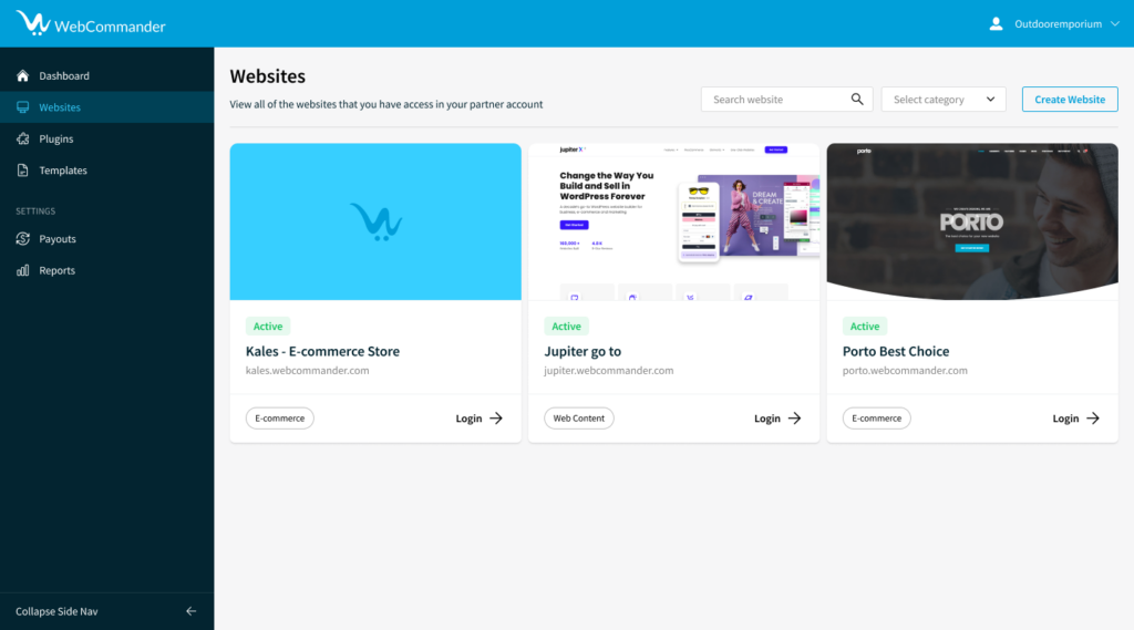
- Click on the “Create Website” Button.
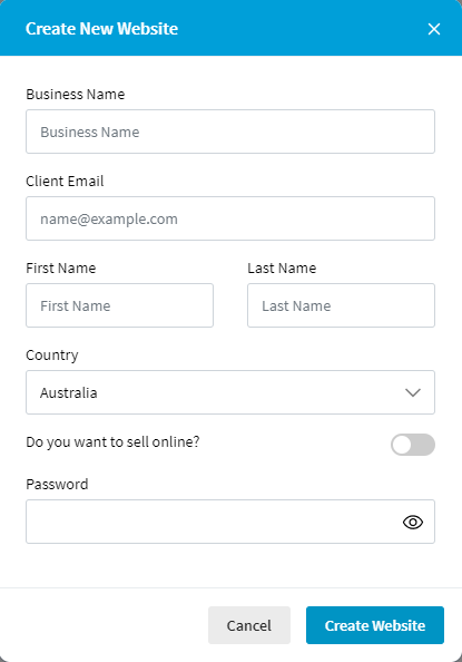
- Enter the Business Name, Client Email, First and Last Name, and Country Name of the client.

- Answer the question “Do you want to sell online?” with Yes or No. If the answer is Yes, an e-commerce site will be deployed. If the answer is No, a web content site will be deployed.
- If the website is deployed successfully, it will carry an “Active” status.

Managing a Website
Once a website is created, you can manage it by following the steps given below:
- Click on “Website” from the sidebar menu.
- You will see a list of websites that you have created.
- You can identify each website as Ecommerce or WebContent.
- You can log in to each website to manage it.
- Access the details view page of a website by clicking on the corresponding tile or card.
- You can update the website’s information and upload images from the details view page.
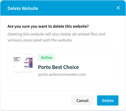
- To delete a website, click on the delete button, and confirm it with the popup message.

Client Login Details
You can provide login details to your client by following the steps given below:
- Access the details view page of a website by clicking on the corresponding tile or card.
- To send login information to your client, click on the kebab menu or three-dot menu, and choose the “Send login info to client” option.
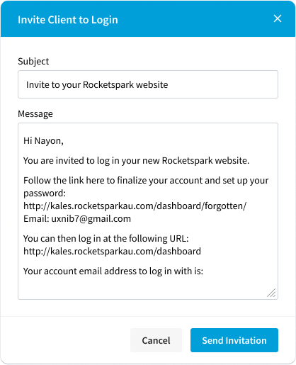
- A popup titled “Invite Client to Login” will appear, displaying the email subject and message that you can use to invite your client to log in.

- To share the login information with your client, click on the “Send invitation” button.
By following the steps mentioned above, you can create websites for your clients, manage them, and provide login details to your clients. In case you face any glitches or errors while creating or managing a website, you will see an error message screen. For any further assistance or queries, please contact our support team.
Skip-control
Skip-control is an attribute used to specify which controls are not displayed in the Left panel. The value of the attribute is a string that contains a list of control names, separated by hyphens.
skip-control="backgroundAttach":It specifies that the background attachment control should be hidden in the Left panel. The background attachment property specifies whether a background image should scroll with the content or be fixed.skip-control="color":It specifies that the colour control should be hidden in Left panel.skip-control="link-target":It specifies that the link target control should be skipped Left panel.skip-control="textAlign":It specifies that the text alignment control should be hidden in Left panel. The text alignment property specifies the horizontal alignment of text within a content block.skip-control="cloneButton-moveButton": It specifies that the clone button and move button controls should be hidden in Left panel.skip-control="link-target-textAlign": It specifies that the link target and text alignment controls should be hidden in Left panel.skip-control="fontSize-textAlign":It specifies that the font size and text alignment controls should be hidden in Left panel.skip-control="link-target-fontSize-textAlign":It specifies that the link target, font size, and text alignment controls should be hidden in Left panel.skip-control="backgroundAttach-textAlign":It specifies that the background-attachment and text alignment controls should be hidden in Left panel.skip-control="backgroundAttach-textAlign-marginTop-marginBottom":It specifies that the background attachment, text alignment, margin-top, and margin-bottom controls should be hidden in Left panel.skip-control="color-fontSize-textAlign-margin-padding-backgroundAttach":It specifies that the color, font size, text alignment, margin, padding, and background attachment controls should be hidden in Left panel.skip-control="margin-padding-background":It specifies that the margin, padding, and background controls should be hidden in Left panel.skip-control="link-target-cloneButton-moveButton": It specifies that the link target, clone button, and move button controls should be hidden in Left panel. The link target allows a user to specify the URL to which a link should point, the clone button allows a user to duplicate a content block, and the move button allows a user to move a content block to a different position.
Using Snippets on Page
Let’s walk through the steps to seamlessly integrate a snippet, using the example of a “Contact Us” snippet:
Begin by navigating to the ‘Page’ section, conveniently nestled under the ‘Web Content’ menu option.
Identify and select the specific page where you’d like to incorporate the snippet. Click on the gear icon linked to that page.
Opt for the ‘Edit Content’ option from the assortment available, setting the stage for content enhancement.
Embark on your journey within the ‘Edit Content’ screen. On the left panel, you’ll find your toolkit ready for action. The right panel offers a real-time preview, enabling you to witness the visual impact of changes instantly.
Invoke the power of the snippet by utilising the search bar. Type “Snippet” to focus your attention on this dynamic functionality.
Grasp the Snippet Widget and seamlessly drag it onto the right panel. Find the perfect spot where the snippet’s magic will come to life.
Delve into the left panel’s widget options and elegantly select the snippet that perfectly aligns with your creative vision.
Confirm your actions by clicking ‘Save.’ You have successfully orchestrated the strategic integration of the snippet.
Marvel at Your Creation: With this simple yet robust process, your snippet has seamlessly taken its rightful place on your website.
Create Snippet
This section outlines the process of seamlessly integrating and customising snippets within your web content through WebCommander’s platform. These steps provide a structured approach to efficiently create and tailor snippets to your specific needs.
Begin by navigating to the ‘Content’ section. This section is conveniently located under the ‘Web Content’ menu option.
On the left panel, select the new snippet creation. This action triggers the appearance of a pop-up interface.
Within the pop-up, you’ll encounter an array of templates at your disposal. Utilise the search bar for swift access to your desired template. Alternatively, explore categorised filters to align with your specific requirements.
Upon identifying your desired template, proceed to insert it into your content. Depending on your code editor, you’ll encounter either a “Use Snippet” or “Insert Snippet” button. Engage this button, seamlessly incorporating your chosen template into your coding environment.
Personalise your snippet with a suitable name and description, reflective of its purpose. Once satisfied with your labelling, save your progress by selecting the ‘Save’ option.
Following your save action, the system will automatically transition you to the snippet editing interface. Here, customisation opportunities await.
Embrace the potential for visual refinement. Adjust text elements, text colours, font sizes, alignments, margins, and padding to match your vision. Navigate these customisations seamlessly through the visual editor situated in the left panel.
When your customisation is complete, finalise your efforts by clicking the “Save” button.
Upon successful customisation, a confirmation dialogue will appear, reaffirming the successful preservation of your snippet.
Data Attribute
Data attributes are custom attributes that allow you to store extra information on an HTML element. You can use data attributes to add additional information to an element that is not visible to the user, but can be used by scripts or other programs that interact with the page.
To create a snippet in HTML with data attributes, you can use the “data-” prefix to add custom attributes to your HTML elements. For example, to create a snippet container element, you could use the following code :
1. <div data-style-type="container">
2.  <!-- Your snippet content goes here -->
3. </div>
Similarly, you can use the other data-style-type attributes such as data-style-type="html", data-style-type="text", data-style-type="image", and data-style-type="icon" to specify the type of content being added to the snippet. For example, to add an image to your snippet, you could use the following code:
1. <img src="path/to/image.jpg" data-style-type="image" alt="My image snippet">Defining a data attribute in a snippet template allows the Left panel to display the appropriate options for modifying the content within the snippet. For example, if the data attribute is set to “text”, then the Left panel would display options to modify the text content, font size, and color.
Similarly, if the data attribute is set to “container”, the Left panel would display options to modify the container element, such as changing the background image, margin, and padding. By using data attributes, users can easily modify the content and appearance of a snippet template using the Left panel without needing to directly modify the HTML code.
data-style-type="container": Specifies that if the data attribute is set as a container, then in the Left panel, options would be available to change the container element’s Left such as background image, margin, padding, etc.data-style-type="html": It specifies that the content being added is raw HTML code.data-style-type="text": Specifies that if the data attribute is set as text, then in the Left panel, options would be available to change the text content, font size, font color, etc.data-style-type="image": Specifies that if the data attribute is set as an image, then in the Left panel, options would be available to upload and change the image.data-style-type="icon": Specifies that if the data attribute is set as an icon, then in the Left panel, options would be available to select and change the icon..data-style-type="btn": Specifies that if the data attribute is set as a button, then in the Left panel, options would be available to change the button text, font size, font color, button background color, etc.data-style-type="link": It specifies that the content being added is Link and options would be available in Left panel to modify it.data-style-type="video": Specifies that if the data attribute is set as a video, then in the Left panel, options would be available to upload and change the video.data-cloneable: Specifies whether the content can be cloned or duplicated. A value of “true” indicates that the content can be cloned, while a value of “false” indicates that it cannot.data-editable: Specifies whether the content can be edited. A value of “true” indicates that the content can be edited, while a value of “false” indicates that it cannot.icon-class: Specifies the class name of an icon to be used with the content. The value of this attribute should be a string beginning with a#symbol, followed by the class name.wrapper-link: Specifies a link to be associated with the content. The value of this attribute should be a string containing the URL of the link.
Add Code to Snippet Template
To add code to the snippet template, the following steps you need to follow :
Select the snippet and click on ![]() gear icon.
gear icon.
From the options, click on Edit Content. A new page titled “Snippet Template Information” will appear.
Click on the “Drop Image/Click Here ![]() button to select an image from your local device.. A snippet thumbnail image is a visual representation of a code snippet. It can be used to provide a visual representation of the code snippet.
button to select an image from your local device.. A snippet thumbnail image is a visual representation of a code snippet. It can be used to provide a visual representation of the code snippet.
In the code editor provided, enter the HTML and CSS code for your snippet.
To Upload an image, select “Images” from the dropdown menu and then click on the “Upload” button to select the image file from your local system. Once the image is uploaded, it can be used in the template by referencing the path of the uploaded image file.
If you need to upload a file or other asset that is not an image, choose “Other” from the dropdown menu and then use the “Upload” button to select the file from your local system. Once the file is uploaded, it can be referenced and used in the template just like any other asset.
Save the snippet by clicking on a button labelled “Update”.
Adding Snippet Template
Start by navigating to the ‘Content’ section within the platform. You’ll find this section conveniently under the ‘Web Content’ menu option.
Click the “Create” button, initiating the creation of a new snippet template.
Provide an accurate name for your snippet template. Make it descriptive – for instance, name it “Contact Us” if the snippet pertains to the contact block.
Choose a suitable category from the dropdown menu. Opting for the correct category ensures organisation and swift access. This step is pivotal in streamlining your snippet management process.
Click ‘Save’ to preserve your newly crafted snippet template.
Witness your snippet template listed, ready to be deployed for enhanced functionality.
Congratulations! You’ve seamlessly integrated a snippet template into your website.
Snippet
A snippet template is a component in Web Commander to display static content. It refers to a reusable piece of code or functionality that can be added to a web page. A snippet template can be used to add various elements to a website, such as forms, images, buttons, and more.
Snippets template can be a great way to add common elements to a website quickly and easily, without the need for extensive coding knowledge. Additionally, using snippets template can help ensure consistency and standardisation across a website, as they provide a standardised way to add certain elements and features.
Why Snippet Templates Are Essential?
- Snippet templates provide a structured and consistent way of creating and reusing code snippets across your website.
- By defining a template, you can ensure that all code snippets follow the same structure and conventions, making them easier to read and maintain.
- The use of snippets can help streamline the web development process and make it easier for non-technical users to add new features to their websites without coding. Users can change the text, layout, page Left, etc. of a snippet from the editor.
When should you avoid creating Snippet Templates?
may not be appropriate to use them. Here are some situations in which you should avoid creating a snippet template:
- If the block you’re working on is one-time or unlikely to be reused, creating a snippet template may not be worth the effort. In this case, it is more efficient to write the code as needed rather than creating a template that will not be used again.
- If the code you’re working on is very specific to a specific project or use case, creating a general-purpose snippet template may be impractical. In this case, it is preferable to write the code within the context of the project rather than attempting to create a template that may or may not be applicable to other projects.
In this documentation, we will cover how to install, use, and customise snippets for use in your Web Commander projects.